First grade
The Color Wheel
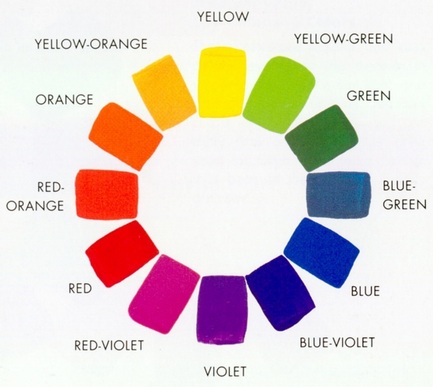
The color wheel is very important for artists when creating a work of art for selecting colors or mixing colors, just as it is important for viewers of art to know about the colors and the way they work together to understand the paintings that the artists created.
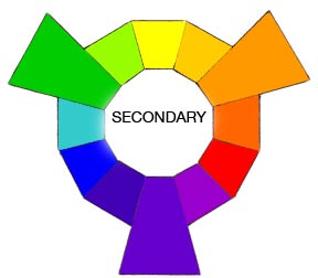
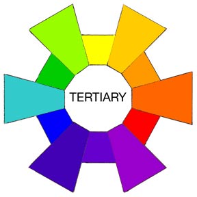
The PRIMARY colors are those from which all other colors are mixed. In art, those primary colors are red, yellow and blue. If you mix the primary colors with each other, you create the SECONDARY colors. The primary colors red and yellow mixed together create the secondary color orange. Red and blue make purple (also called violet). And blue and yellow make green. The primary and secondary colors can then be mixed together to create TERTIARY colors (such as yellow mixed with green creating yellow-green).
The PRIMARY colors are those from which all other colors are mixed. In art, those primary colors are red, yellow and blue. If you mix the primary colors with each other, you create the SECONDARY colors. The primary colors red and yellow mixed together create the secondary color orange. Red and blue make purple (also called violet). And blue and yellow make green. The primary and secondary colors can then be mixed together to create TERTIARY colors (such as yellow mixed with green creating yellow-green).

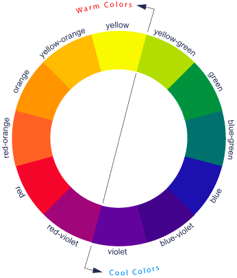
There are more things the color wheel can show us. Notice how the colors next to each other on the color wheel are very similar and blend nicely together (blue and blue-violet for example), but the colors across from each other on the color wheel are very different and have strong contrast (blue and orange). This can help an artist when they are deciding if they want a calmer picture (then they should use colors close together) or exciting picture (contrasting colors give the picture more energy).
Color also has a temperature--not like a sick person has a fever of course (that's silly!), but some colors appear warmer and some appear cooler. See the chart below. This is mainly because of their association with things in nature. Think of the sun in the sky or a blazing fire--what colors are they? That is why the red, orange, yellow side of the color wheel is the WARM COLOR side. Now think about the ocean or rain or a mountain forest. What colors are they? Now you see why the green, blue, violet side of the color wheel is the COOL COLOR side. Artists may want to choose either warm colors or cool colors for their painting to give a specific feeling or to depict a certain emotion.
Color also has a temperature--not like a sick person has a fever of course (that's silly!), but some colors appear warmer and some appear cooler. See the chart below. This is mainly because of their association with things in nature. Think of the sun in the sky or a blazing fire--what colors are they? That is why the red, orange, yellow side of the color wheel is the WARM COLOR side. Now think about the ocean or rain or a mountain forest. What colors are they? Now you see why the green, blue, violet side of the color wheel is the COOL COLOR side. Artists may want to choose either warm colors or cool colors for their painting to give a specific feeling or to depict a certain emotion.
Color is one of the most important parts of creating and understanding art. Colors affect the way we feel about a work of art. Different colors can make us happy or sad, calm or excited. Colors can blend together nicely, or contrast in a jarring way. They can be bright or dull. Learning about the color wheel helps us understand art better.
The Project
Prep – 30 min.
Print – Color wheel poster
Materials
12 x 18 white construction paper, 1 per student
Various color strips of scrapbook (cabinet D) and construction paper (6 x 3 inches, 10-12 per student, colors should go with color wheel poster)
Brown, grey, and green pieces of construction paper for center (grey), stem (brown), and leaves (green)
Glue bottles (usually in class)
Lesson
- Show
students color wheel poster and talk about colors.
- Ask
students what the primary colors are?
Show where red, yellow, and blue are on the wheel. Ask students what happens when you mix yellow
and blue – you get green! Show green on
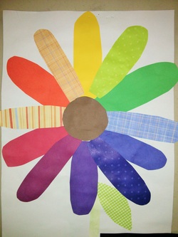
color wheel – explain that green, orange, and purple are secondary colors. Explain Tertiary colors.
- Show
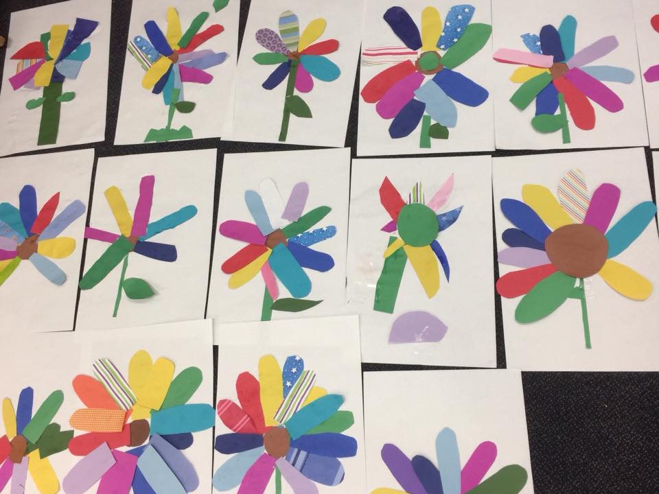
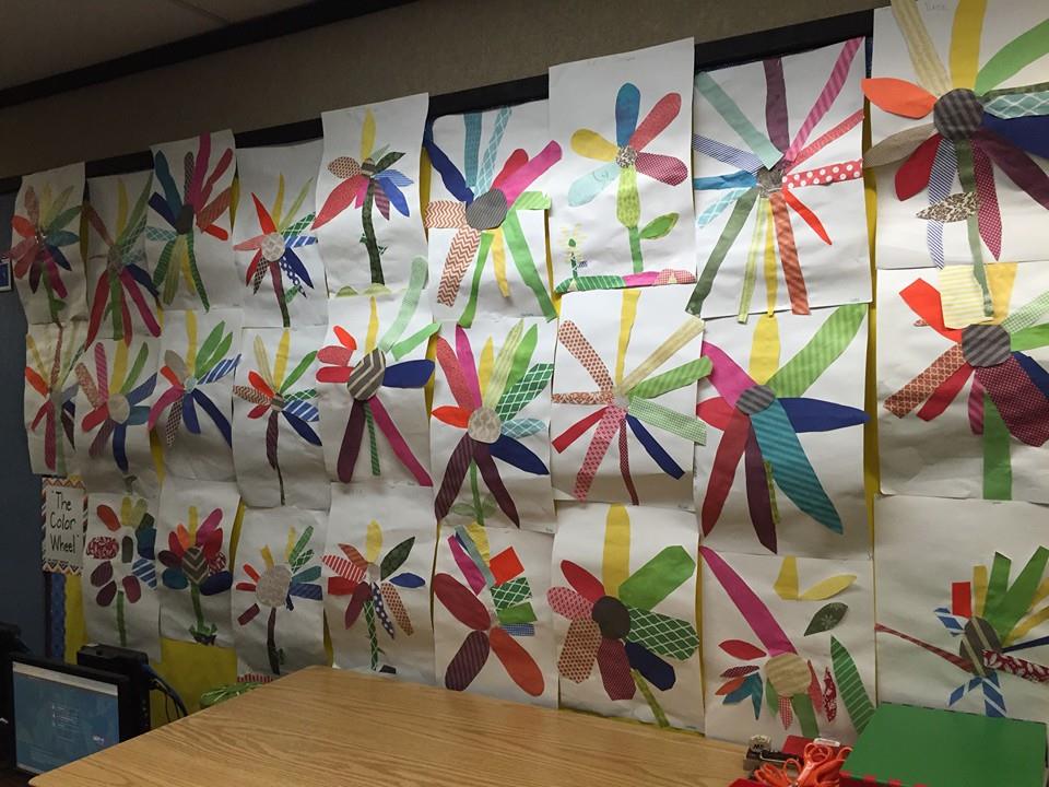
strips of paper. Model cutting a flower
petal. Students will free cut flower
petals without drawing (they will all look different, that is ok).
- Have
students start by putting their name on back of paper. Use paper vertically, good to talk about
vertical and horizontal again!
- Place
paper strips of all colors in center of each table. Have students make a color wheel with 10-12
pieces of paper. Start with primary
colors, secondary colors, etc. Placing
on paper to see wheel. Pick up one and
cut petal, place back on wheel, continue till all petals are cut out. Have students raise hand so that parent
helpers can check color arrangement before they glue. Remind them, "dot, dot, not a lot" with
glue! Glue down petals. Students then cut out center, stem, and
leaves and glue down.